Stop Overcomplicating Your Charts:
4 Setups That Matter
If you’re trading stocks or options, it’s easy to overload your charts with too many indicators. Momentum indicators, Bollinger Bands, stochastics, Fibonacci levels, ADX, RSI - before you know it, the chart is creating more confusion than clarity.
That’s why I prefer a simpler approach. Instead of trying to make one chart tell me everything, I use 4 different chart setups, with each one designed to answer a different question.
Chart #1: The Naked Chart
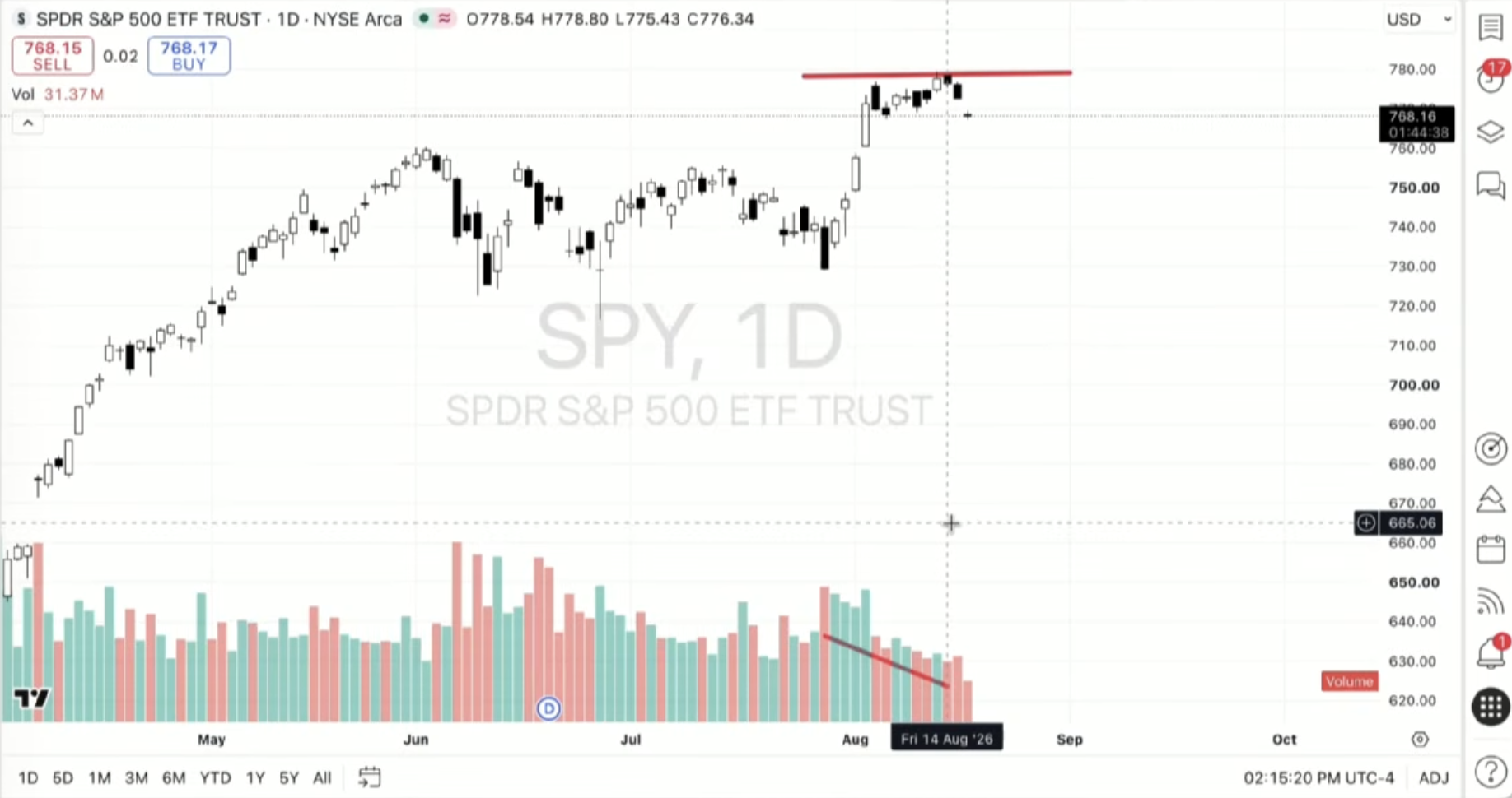
The first chart I use is the simplest: candlesticks, price action, and volume.
This helps me step back and ask the most important question first: What is the stock actually doing?
Is it trending higher, moving lower, or trading sideways? Is momentum building or starting to stall?
The naked chart helps me read price and volume without immediately depending on another indicator to tell me what to think.
Chart #2: The Moving Average Chart
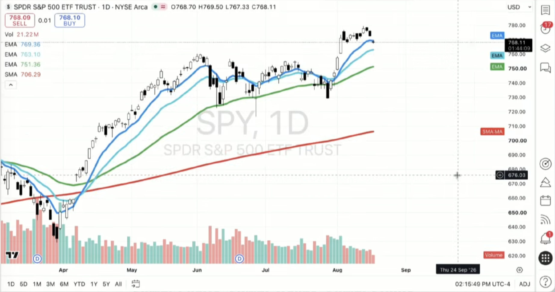
Once I understand the overall trend, I use moving averages to look for potential support, resistance, pullbacks, and shifts in momentum.
If a stock repeatedly pulls back toward the same moving average and bounces, that gives me an area worth watching. It doesn’t mean I automatically buy when price reaches that level.
It gives me another piece of evidence to help build a trading thesis.
Chart #3: The Bollinger Band Chart
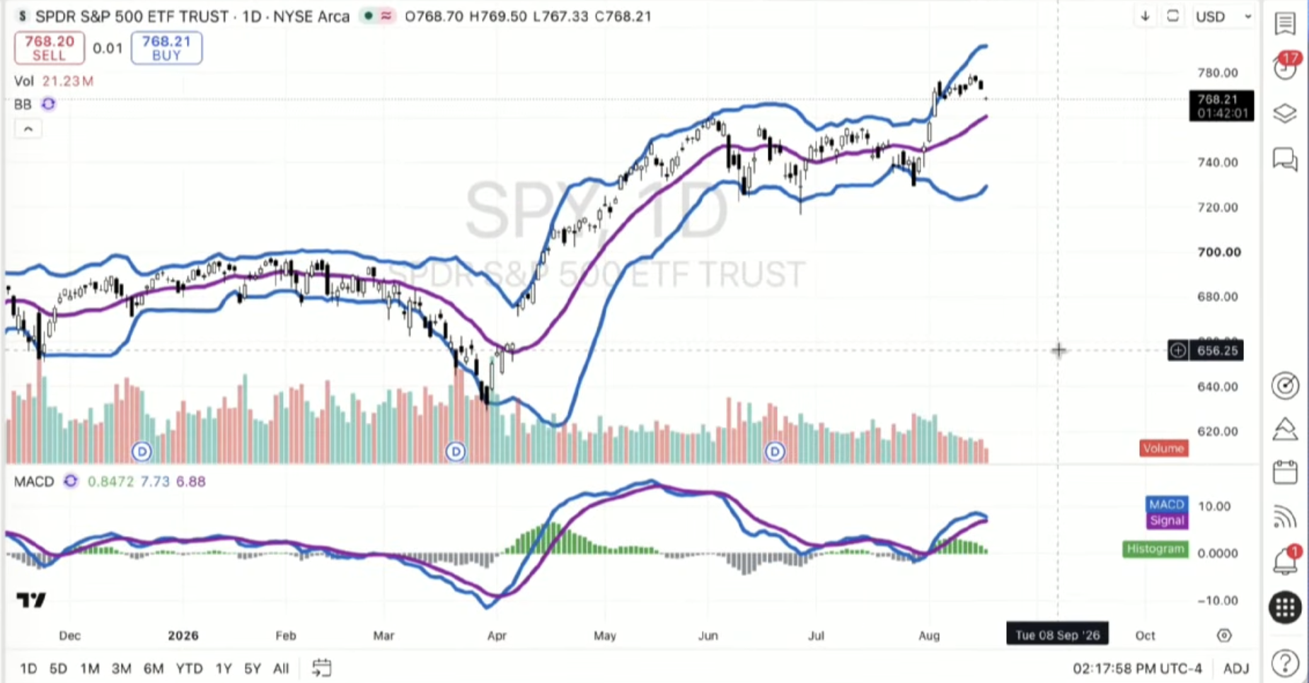
My third setup focuses on volatility and momentum.
When Bollinger Bands begin tightening, it can signal a period of lower volatility. That doesn’t tell me which direction the stock will move, but it tells me to pay attention.
If price then breaks higher or lower as volatility expands, that can provide another clue about the strength of the move. This can be especially important for options traders because volatility also influences option pricing.
Chart #4: The Stochastic Chart
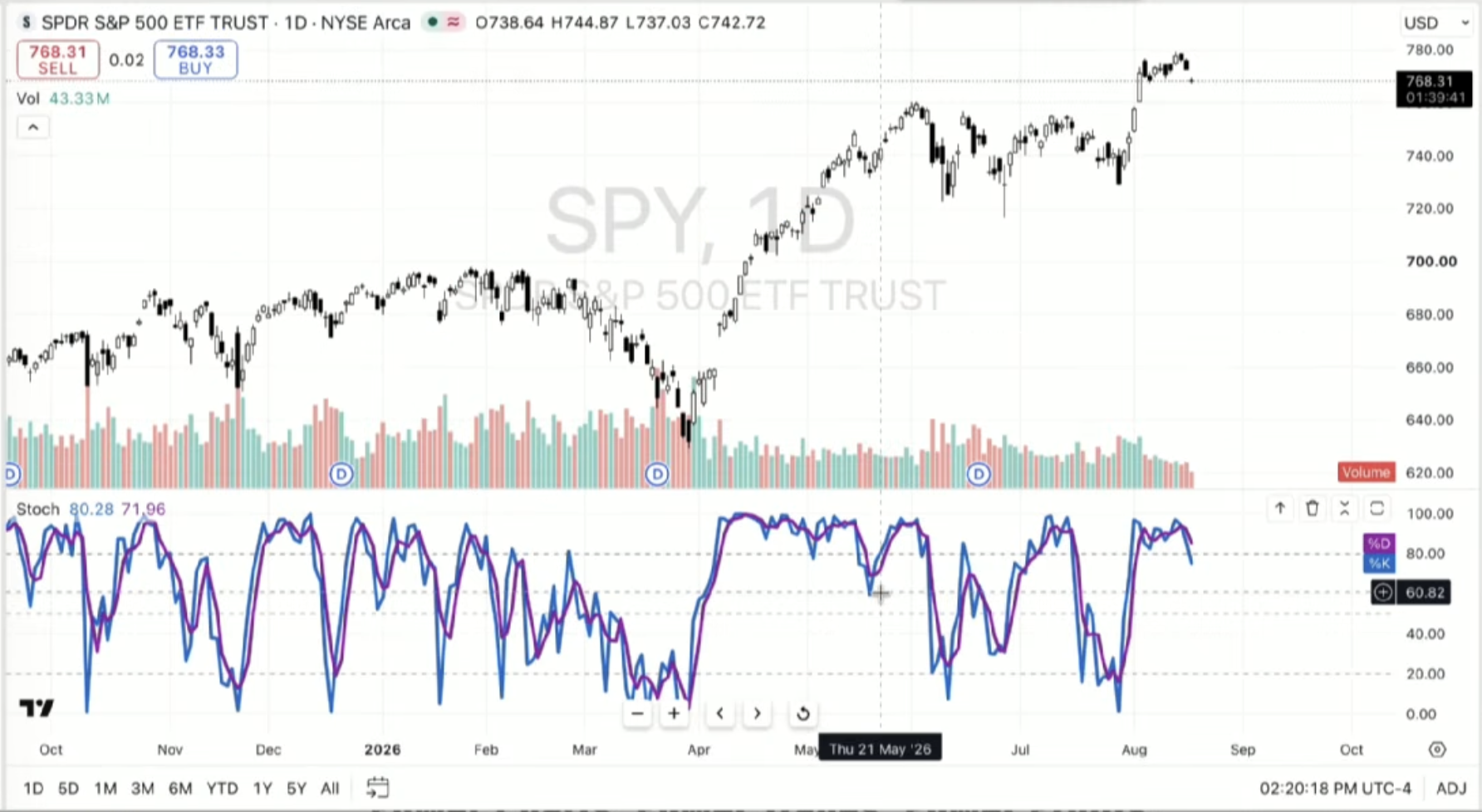
The stochastic chart is one I find particularly useful when a stock is moving sideways inside a defined range.
It can help show where momentum is within that channel and whether price is moving toward an overbought or oversold area. But stocks don’t stay in channels forever, which is why I don’t believe every indicator belongs on every chart all the time.
The market environment determines which tool deserves your attention.
Your Indicators Should Answer a Question
The biggest takeaway is that technical analysis shouldn’t be about collecting as many indicators as possible.
Every indicator should have a purpose.
My naked chart asks: What is price actually doing?
My moving average chart asks: What trend is the stock presenting?
My Bollinger Band chart asks: What is happening with volatility and momentum?
My stochastic chart asks: If the stock is moving sideways, where are we within that movement?
Technical analysis isn’t a crystal ball. I’m looking for evidence that helps me create a plan and make a more educated decision.
Keep Your Charts Simple
Your trading chart doesn’t need to look like the cockpit of an airplane.
More indicators do not automatically create better decisions. Sometimes the best thing you can do is simplify the chart and give each setup one job.
That’s how I use these four chart setups inside my own technical analysis process, and it’s the same framework I share with traders inside Power Trades University.
The goal isn’t to make your charts more complicated.
It’s to build a repeatable process that helps you better understand when to trade, when to wait, and when the risk may simply not be worth taking.